
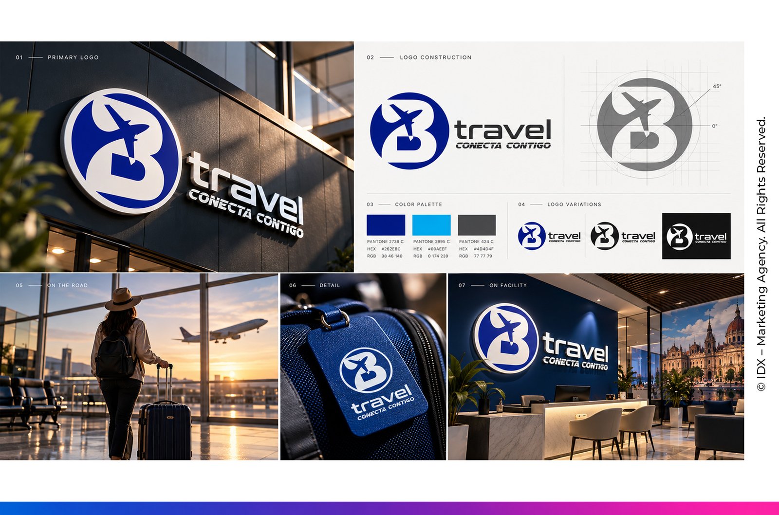
One identity.
Every journey.
A clear and adaptable visual identity created for B Travel, a travel agency in Mexico City.
Designed to be
understood.
The identity was developed around clarity and versatility. A recognizable symbol, contemporary wordmark and direct visual language allow the brand to work naturally across digital, physical and travel-related applications.
The goal was simple: create a travel logo that could be identified quickly, reproduced consistently and remain recognizable wherever the customer encounters the brand.
CONECTA
CONTIGO
Short. Direct. Identifiable.
One brand.
Multiple touchpoints.
Explore how the identity adapts while maintaining the same recognizable visual language.
Digital
Clear recognition across websites, social media, advertising and digital communications.
Travel
A compact visual system suited for luggage tags, travel documents and customer touchpoints.
Spaces
Strong visibility for office environments, architectural signage and physical locations.
One Color
The mark remains recognizable without depending on gradients, photography or complex effects.
Built around
recognition.
Clear
Immediate visual reading without unnecessary complexity.
Flexible
Designed to work across different sizes, formats and applications.
Memorable
A distinctive symbol and slogan create a consistent point of recognition.